CSS level 3 & beyond ..
The full CSS specification is available at http://www.w3.org/Style/CSS/specs.en.html. There is a summary at: http://www.css3.info.
The current recommendation is available at: https://www.w3.org/TR/css-2018/
A selection of CSS3 modules is the following:
- CSS Color
- CSS Namespaces
- CSS Selectors
- CSS Media Queries
- CSS Backgrounds & Borders
- CSS 2D Transformations
- CSS Transitions
- CSS Animations
- CSS 3D Transformations
- CSS Flexible Box Layout
- CSS Fonts
- CSS Text
- CSS Grid Layout
- CSS Image Values and Replaced Content
CSS Selectors
One of the most important feature of the CSS specification is selectors. Using selectors, we can specify one or several html elements to which we can apply visual formatting. In the following lines, we describe the most important selectors from the CSS3 specification (some selectors were introduced by previous versions of the CSS standard).- E[attr^=“str”] - an E element whose “attr” attribute begins with “str”
- E[attr$=“str”] - an E element whose “attr” attribute ends with “str”
- E[attr*=“str”] - an E element whose “attr” attribute contains “str”
- E[attr=“str”] – an E element whose “attr” attribute is equal to “str”
- E:nth-child(n) - an E element, the n-th child of its parent
- E:nth-last-child(n) - an E element, the n-th child of its parent, counting from the last one
- E:nth-of-type(n) - an E element, the n-th sibling of its type
- E:nth-last-of-type(n) - an E element, the n-th sibling of its type, counting from the last one
- E:first-child - an E element, first child of its parent (in CSS2.1)
- E:last-child - an E element, last child of its parent
- E:first-of-type - an E element, first sibling of its type
- E:last-of-type - an E element, last sibling of its type
- E:only-child - an E element, only child of its parent
- E:only-of-type - an E element, only sibling of its type
- E:empty - an E element that has no children
- E:not(s1,s2,..) - an E element that does not match selectors s1,s2,..
- E:is(s1,s2,..) - an E element that matches one of selectors s1,s2,..
- E > F - an F element child of an E element (in CSS2.1)
- E + F - an F element immediately preceded by an E element (in CSS2.1)
- E ~ F - an F element preceded by an E element
- * - selects everything, every tag
- E:has(> F) – an E element that has an F child
- E[attr="str" i] – an E element with an attribute "attr" equal cu "str" (case insensitive)
- E[attr="str" s] – an E element with an attribute "attr" equal cu "str" (case sensitive)
- E:current, E:past, E:future - timeline selectors, select an element in a time-dimensional canvas; Ex.:
:current(p) { background : yellow } - selects and colors the paragraph of text that is currently read in a speech rendering of the document
Gradient colors and graphics transforms
A linear gradient is a CSS function that variates the color (usually the background color) of an element liniarly. The syntax of the linear-gradient function is:background: linear-gradient([direction], color-stop1, color-stop2,…) where
- direction=< angle > | [to] < side-or-corner >
- angle=0deg, 90deg, 100deg, ..
- side-or-corner=bottom, top, right, left
- color-stop=blue, red, .., rgb(rrr, ggg, bbb), rgba(rrr, ggg, bbb, aaa) where aaa=1 (no transparency) and aaa=0 (full transparency)
A linear repeating gradient is just a linear gradient that repeats in a direction. Its syntax is:
background: linear-repeating-gradient ([direction], color-stop1, color-stop2,…)
And the parameters are the same as for the simple linear gradient. Two examples of radial-gradients with different color stops are exemplified below. One is 1px thick and the other is 40px thick and they both expand horizontally to 100% of its parent's width.
.grad1 {
		width: 100%;
		height: 1px;
		display: block;
		background: linear-gradient(to left, #ffffff, #000000, #ffffff);
}
.grad2 {
		width: 100%;
		height: 40px;
		display: block;
		background: linear-gradient(to top, rgba(30,100,255,0.85), rgba(140,175,255,0));
}
A radial gradient is a center/elliptical gradient defined by its center. The syntax of the radial-gradient function is similar to the one of linear-gradient and is the following:
background: radial-gradient(<center position> <shape> <size>, color-stop1, color-stop2, …) where
- <center position> = center(default) or position given with 2 points
- shape = circle or ellipse
- size = the radius(es) of gradient given as <length> | <percentage> or closest-side, farthest-side, closest-corner, farthest-corner
background: radial-repeating-gradient(<center position> <shape> <size>, color-stop1, color-stop2, …)
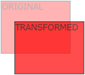
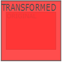
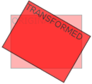
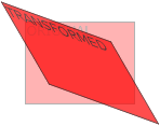
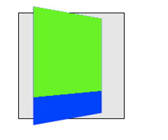
Another important area of functionality of CSS is graphic transformations. Using the transform property and transform functions we can translate, scale, turn, spin and stretch html elements. These graphic transforms can be 2D or 3D. Chrome uses –webkit- prefix for transform properties. The CSS properties that can be used to transform the graphic canvas of an html element are transform and transform-origin. The transform property applies a 2D or 3D graphic transform to an html element. These transformations are specified as a sequence of functions. The syntax is the following:
transform : transform-function1 transform-function2 ..
The second transform property is transform-origin which allows the user to change the position on transformed elements (moves the point of origin of transformation). Its syntax is:
transform-origin : <percentage> | <length> | left | center | right | top | bottom
There are several 2D transform functions that can be used as value of the transform propery. These functions have different types:
- translate functions:
- translate(x,y) – moves the element along the X and Y axes
- translateX(x) – moves the element x pixels along the X axis
- translateY(y) – moves the element y pixels along the Y axis
- scale, skew, rotate, general transformation functions:
- scale(x,y) – changes the width to x times the original and the height to y times the original
- scaleX(x) – changes the width to x times the original
- scaleY(y) – changes the height to x times the original
- rotate(angle) – rotate element by angle; ex.: rotate(45deg);
- skew(x-angle,y-angle) – skew transform along the X and Y axes
- skewX(x-angle) – skew transform along the X axis
- skewY(y-angle) – skew transform along the Y axis
- matrix(n,n,n,n,n,n) – general transformation
- transform : transform-function1 transform-function2 ..
- transform-origin : <percentage> | <length> | left | center | right | top | bottom
- transform-style : flat | preserve-3d
- perspective : none | number | x y
The corresponding 3D transform functions that can be used as values for the transform property are:
- translate3d(x,y,z)
- translateX(x)
- translateY(y)
- translateZ(z)
- scale3d(x,y,z)
- scaleX(x)
- scaleY(y)
- scaleZ(z)
- rotate3d(x,y,z,angle)
- rotateX(angle)
- rotateY(angle)
- rotateZ(angle)
- perspective(n)
- matrix3d(n,n,n,n,n,n,n,n,n,n,n,n,n,n,n,n) – 3D transform 4x4 matrix
Transitions and animations
Transitions add effects when changing from a style to another (e.g. when :hover is used), like flash or javascript. So they are simple animation effects in CSS. CSS animations are more complex animation effects discussed below. The style properties used for CSS transitions are:- transition-property : comma separated list of property names to which transition is applied
- transition-duration : how long it take the transition to be completed (ex.: transition-duration : 2s)
- transition-delay : when transition will start (ex.: transition-delay: 1s)
- transition-timing-function : defines the speed of the transition; values: linear|ease|ease-in|ease-out|ease-in-out|cubic-bezier(n,n,n,n)
- transition : shorthand property for the above properties
div {
	transition-property: width;
	transition-duration: 5s;
}
div:hover { width: 100px }
div {
	width: 20px;
	transition: width 3s, transform 3s;
}
div:hover {
	width: 100px;
	transform: rotate(90deg);
}
- @keyframes : defines the frames of the animation
- animation-name : defines the animation name, used in @keyframes
- animation-duration : duration of the animation
- animation-timing-function : defines the speed of the transition; values: linear|ease|ease-in|ease-out|ease-in-out|cubic-bezier(n,n,n,n)
- animation-delay : startup delay (in seconds)
- animation-iteration-count : how many times the animation is played
- animation-direction : the direction in which animation is played (normal | reverse | alternate | alternate-reverse)
- animation-play-state : running or pausing the animation
- animation – shorthand property
@keyframes name-of-animation {
		keyframe-selector {
			property: value;
			…
			property: value;
		}
		…
		 keyframe-selector {
			property: value;
			…
			property: value;
		}
}
An example of an animation that moves a div from 100 pixels to 150 pixels in 5 seconds is depicted below.
@keyframes move {
		0% { left: 100px; }
		40% { left: 130px; }
		100% { left: 150px; }
}
div {
	animation: move 5s;
}
Borders, shadows, backgrounds and sprites
We can round the corners of the border of an element with border-radius. There are two radix values for each corner : top-left, top-right, bottom-right, bottom-left. The syntax is the following:border-radius : (<length> | <percent>) {1,4} / (<length> | <percent>) {1,4}
Example: div { border-radius : 10px 10px 20px 20px / 5px 5px 10px 10px }
Another CSS3 feature is to use images as borders. The syntax for this is:
border-image : source slice width outset repeat
where 'source' is the image used for border, 'slice' is 4 inward offsets of the border image for top, bottom, left and right sides, 'width' is 4 widths of the border image for top, bottom, left and right sides, and outset is also 4 values, the amount the border image that extends outside the border of the box.
CSS3 allows to have several background images for an element, defined using the background property. Sprites are several images contained in one image which can individually be used as backgrounds by setting different values for background-position. Using background-position and width and height we can cut a part of the background image.
Example:
div {
	background : url('sprite.png');
	background-position: -0px -0px;
	width: 275px;
	height: 275px;
}
text-shadow : h-shadow v-shadow blur color
and it specifies the thickness of the shadow horizontally, the thickness of the shadow vertically, the bluriness of the shadow and the collor of the shadow. An example of textual shadow CSS is the following:
div {
	text-shadow: 2px 2px 4px #ff00dd;
}
box-shadow : h-shadow v-shadow blur spread color inset
The 'inset' parameter specifies whether it is an inner or outer shadow of the box. An example of box shadow CSS is the following:
div {
	box-shadow: 4px 6px 6px -2px #aaaaff;
}
CSS flexbox display
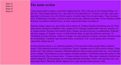
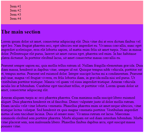
The flex display is just a modern, flexible display mode introduced by CSS3 that replaced the old ways of displaying children of an html element on the same line or on different lines in a grid-like pattern. Previously, one would achieve this using display: inline, display: inline-block or float: left. So, display flex allows the contents of a container to be displayed in a flexible grid (organized in rows and/or columns); and it is highly customizable. An example of display flex that also evidentiates the syntax of flex display and related CSS properties is the following.
<div class="flexdiv">
<div> 1 </div>
<div> 2 </div>
</div>
.flexdiv {
	display: flex;
	flex-direction: column | column-reverse | row | row-reverse;
	flex-wrap: nowrap | wrap | wrap-reverse;
	justify-content: center | flex-start | flex-end; // align horizontally
	align-items: center | flex-start | flex-end; // align vertically
}

In the following picture, we can see an example of flex-direction: column:
More flex documentation and flex examples can be checked at: https://css-tricks.com/snippets/css/a-guide-to-flexbox/
Multiple columns
Using CSS3 we can organize html content into multiple columns. The most relevant CSS properties for multiple column layout are described below.- column-count : no. of columns an element is divided
- column-fill : how to fill columns (balance | auto)
- column-gap : space between columns (dimension)
- column-rule-color : color of rule between columns (same as border-color)
- column-rule-style : style of rule between columns (same as border-style)
- column-rule-width : width of rule between columns (same as border-width)
- column-span : span of a column
- column-width : width of columns
- columns : shorthand for column-width and column-count
div {
	column-count : 3;
	column-rule-color : black;
	column-rule-style : dotted;
	column-rule-width : 1px;
}
div {
	columns: 40px 2;
}
Beyond CSS : CSS preprocessors
CSS is not a programming language per-se, although is has come features of programming languages like keywords (all CSS property names and most values of properties are reserved words in CSS). It's more of a specification language, like HTML. And this is enough for simple to medium complexity websites. But for complex websites with a lot of CSS code, other features of programming languages like variables, functions etc. can be very usefull for CSS. And this is what CSS preprocesors offer. CSS pre processors offer functions, variables, inheritance, code reusability, operators, if, loops to CSS. They extend CSS syntax with all the aforementioned constructs. Usually, augmented CSS code is compiled to standard CSS code by a preprocessor written in node.js, ruby etc. Examples of CSS preprocessors are:- Stylus
- Compass
- Less
- Sass
@font-size: 16px;

.bordered (@width) {
	border: @width solid #ddd;
	&:hover {
		border-color: #999;
	}
}

h1 { .bordered(5px);
       font-size: @font-size;
}
Responsive web design
The ideea of responsive web design is to style html documents so that they look good on any device (desktop, tablet, phone). The principle is to react to the resolution of the rendering device and use CSS specifications to shrink, enlarge, hide or move html content in order to look good on any screen. Actually doing CSS responsive web design means obeying a few simple rules:- setting viewport:
<meta name="viewport" content="width=device-width, initial-scale=1.0">
- sets the width of the page to follow the screen width of the device
- sets the initial zoom level to 1 (no zoom)
- do not rely on a particular viewpoint
- use relative (percentage, %) dimensions: width, height
- use flexbox for layout
- use media-querries to apply different styles to large/small screens
- percentages: Ex. width: 100%
- relative to fontsize: em (relative to the root of the document) and rem (relative to the parent’s font-size)
- relative to viewport: vw, vh, vmin, vmax
We can use CSS @media querries to apply CSS style only if a condition is met:
@media only screen and (max-width: 500px) {
    #div1 {
        width: 100%;
    }
}

@media only screen and (min-width: 500px) {
     ….
}
@media only screen and (orientation: landscape) {
     …
}
<style>
body { display: flex; }
#left {width: 25%; background-color: #ff88aa}
#main {width: 75%; background-color: #aa22ff}

@media screen and (max-width: 800px) {
    body {
    	display: flex;
        flex-direction: column;
    }
    #left, #main { width: 100%; }
}
</style>
<body>
	<section id=“left”> …. </section>
	<section id=“main”> …. </section>
</body>
CSS neat typography: web fonts and neat icons
Some other elements that improve the visual formatting of an html document are web fonts. Ones of the most popular web fonts are Google web fonts. Below, you can see a usage example of Google web font Jura.
<link rel="stylesheet" type="text/css"
                href=https://fonts.googleapis.com/css?family=Jura>
<style>
    body {
		color: #cfd2da;
    	font-family: 'Jura', sans-serif;
    	font-size: 0.9rem;
     }
</style>
<link rel="stylesheet" href=”https://fonts.googleapis.com/icon?family=Material+Icons”>

<i class="material-icons" style="font-size:48px;color:red"> folder </i>
<i class="material-icons" style="font-size:48px;color:red">  cloud_upload </i>
<link rel="stylesheet" href=https://cdnjs.cloudflare.com/ajax/libs/font-awesome/4.7.0/css/font-awesome.min.css>

<i class="fa fa-car" style="font-size:60px;color:red;">  </i>

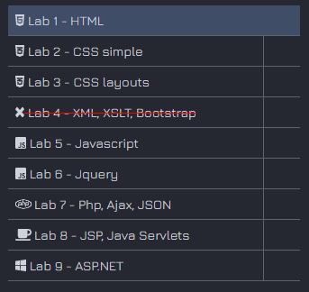
In the following example we can see various fontawesome icons used extensively.
<script defer src=”https://use.fontawesome.com/releases/v5.0.8/js/all.js”> </script>
<li> <div>
      <a href="#" id="1">
          <i class="fab fa-html5"> </i>
           Lab 1 – HTML
      </a>
</div>  </li>
<li> <div>
        <a href="#" id="2">
            <i class="fab fa-css3-alt"> </i>
             Lab 2 - CSS simple
        </a>
</div> </li>
...
References
- http://www.w3schools.com
- http://www.w3c.org